Sep 14, 2022
Reminder: Links to course materials and main sites (Piazza, Canvas, Github) can be found on the home page of the main course website:
https://musa-550-fall-2022.github.io/
Week #2 repository: https://github.com/MUSA-550-Fall-2022/week-2
Recommended readings for the week listed here
Last time
Today

# The imports
import pandas as pd
import numpy as np
from matplotlib import pyplot as plt
%matplotlib inline
So many tools...so little time

You'll use different packages to achieve different goals, and they each have different things they are good at.
Today, we'll focus on:
And next week for geospatial data:
Goal: introduce you to the most common tools and enable you to know the best package for the job in the future

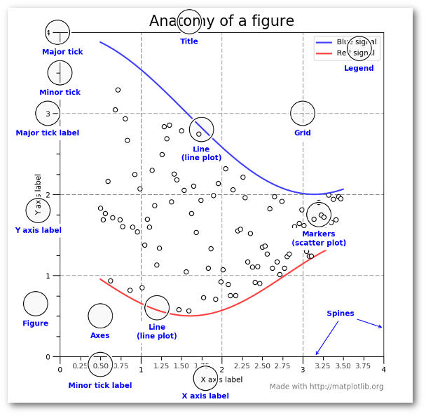
We'll use the object-oriented interface to matplotlib
Create Figure and Axes objects
Add plots to the Axes object
Customize any and all aspects of the Figure or Axes objects
Pro: Matplotlib is extraordinarily general — you can do pretty much anything with it
Con: There's a steep learning curve, with a lot of matplotlib-specific terms to learn
We'll use the Palmer penguins data set, data collected for three species of penguins at Palmer station in Antartica

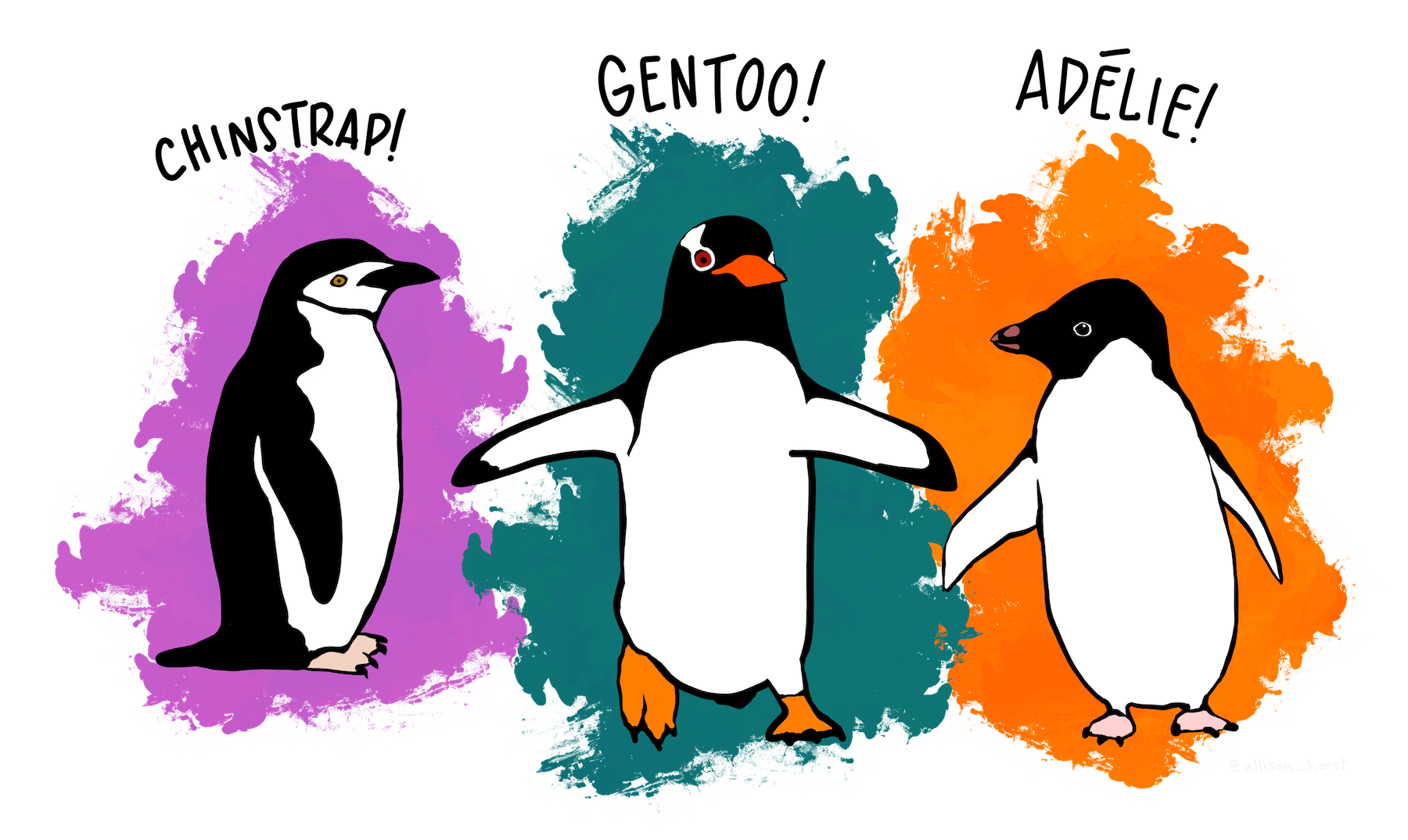
Artwork by @allison_horst
# Load data on Palmer penguins
penguins = pd.read_csv("./data/penguins.csv")
penguins.head(n=10)
| species | island | bill_length_mm | bill_depth_mm | flipper_length_mm | body_mass_g | sex | year | |
|---|---|---|---|---|---|---|---|---|
| 0 | Adelie | Torgersen | 39.1 | 18.7 | 181.0 | 3750.0 | male | 2007 |
| 1 | Adelie | Torgersen | 39.5 | 17.4 | 186.0 | 3800.0 | female | 2007 |
| 2 | Adelie | Torgersen | 40.3 | 18.0 | 195.0 | 3250.0 | female | 2007 |
| 3 | Adelie | Torgersen | NaN | NaN | NaN | NaN | NaN | 2007 |
| 4 | Adelie | Torgersen | 36.7 | 19.3 | 193.0 | 3450.0 | female | 2007 |
| 5 | Adelie | Torgersen | 39.3 | 20.6 | 190.0 | 3650.0 | male | 2007 |
| 6 | Adelie | Torgersen | 38.9 | 17.8 | 181.0 | 3625.0 | female | 2007 |
| 7 | Adelie | Torgersen | 39.2 | 19.6 | 195.0 | 4675.0 | male | 2007 |
| 8 | Adelie | Torgersen | 34.1 | 18.1 | 193.0 | 3475.0 | NaN | 2007 |
| 9 | Adelie | Torgersen | 42.0 | 20.2 | 190.0 | 4250.0 | NaN | 2007 |
Data is already in tidy format
I want to scatter flipper length vs. bill length, colored by the penguin species
# Initialize the figure and axes
fig, ax = plt.subplots(figsize=(10, 6))
# Color for each species
color_map = {"Adelie": "#1f77b4", "Gentoo": "#ff7f0e", "Chinstrap": "#D62728"}
# Group the data frame by species and loop over each group
# NOTE: "group" will be the dataframe holding the data for "species"
for species, group in penguins.groupby("species"):
print(f"Plotting {species}...")
# Plot flipper length vs bill length for this group
ax.scatter(
group["flipper_length_mm"],
group["bill_length_mm"],
marker="o",
label=species,
color=color_map[species],
alpha=0.75,
)
# Format the axes
ax.legend(loc="best")
ax.set_xlabel("Flipper Length (mm)")
ax.set_ylabel("Bill Length (mm)")
ax.grid(True)
# Show
plt.show()
Plotting Adelie... Plotting Chinstrap... Plotting Gentoo...

pandas?¶# Tab complete on the plot attribute of a dataframe to see the available functions
#penguins.plot.scatter?
# Initialize the figure and axes
fig, ax = plt.subplots(figsize=(10, 6))
# Calculate a list of colors
color_map = {"Adelie": "#1f77b4", "Gentoo": "#ff7f0e", "Chinstrap": "#D62728"}
colors = [color_map[species] for species in penguins["species"]]
# Scatter plot two columns, colored by third
penguins.plot.scatter(
x="flipper_length_mm",
y="bill_length_mm",
c=colors,
alpha=0.75,
ax=ax, # Plot on the axes object we created already!
)
# Format
ax.set_xlabel("Flipper Length (mm)")
ax.set_ylabel("Bill Length (mm)")
ax.grid(True)

Note: no easy way to get legend added to the plot in this case...
pandas plotting capabilities are good for quick and unpolished plots during the data exploration phase
import seaborn as sns
# Initialize the figure and axes
fig, ax = plt.subplots(figsize=(10, 6))
# style keywords as dict
color_map = {"Adelie": "#1f77b4", "Gentoo": "#ff7f0e", "Chinstrap": "#D62728"}
style = dict(palette=color_map, s=60, edgecolor="none", alpha=0.75)
# use the scatterplot() function
sns.scatterplot(
x="flipper_length_mm", # the x column
y="bill_length_mm", # the y column
hue="species", # the third dimension (color)
data=penguins, # pass in the data
ax=ax, # plot on the axes object we made
**style # add our style keywords
)
# Format with matplotlib commands
ax.set_xlabel("Flipper Length (mm)")
ax.set_ylabel("Bill Length (mm)")
ax.grid(True)
ax.legend(loc='best')
<matplotlib.legend.Legend at 0x14398e0a0>

The ** syntax is the unpacking operator. It will unpack the dictionary and pass each keyword to the function.
So the previous code is the same as:
sns.scatterplot(
x="flipper_length_mm",
y="bill_length_mm",
hue="species",
data=penguins,
ax=ax,
palette=color_map, # defined in the style dict
edgecolor="none", # defined in the style dict
alpha=0.5 # defined in the style dict
)
But we can use **style as a shortcut!
In general, seaborn is fantastic for visualizing relationships between variables in a more quantitative way
Don't memorize every function...
I always look at the beautiful Example Gallery for ideas.
How about adding linear regression lines?
Use lmplot()
sns.lmplot(
x="flipper_length_mm",
y="bill_length_mm",
hue="species",
data=penguins,
height=6,
aspect=1.5,
palette=color_map,
scatter_kws=dict(edgecolor="none", alpha=0.5),
);

Use jointplot()
sns.jointplot(
x="flipper_length_mm",
y="bill_length_mm",
data=penguins,
height=8,
kind="kde",
cmap="viridis",
);

Use pairplot()
# The variables to plot
variables = [
"species",
"bill_length_mm",
"flipper_length_mm",
"body_mass_g",
"bill_depth_mm",
]
# Set the seaborn style
sns.set_context("notebook", font_scale=1.5)
# make the pair plot
sns.pairplot(
penguins[variables].dropna(),
palette=color_map,
hue="species",
plot_kws=dict(alpha=0.5, edgecolor="none"),
)
<seaborn.axisgrid.PairGrid at 0x143bf3eb0>

sns.catplot(x="species", y="bill_length_mm", hue="sex", data=penguins);

Great tutorial available in the seaborn documentation
The color_palette function in seaborn is very useful. Easiest way to get a list of hex strings for a specific color map.
viridis = sns.color_palette("viridis", n_colors=7).as_hex()
print(viridis)
['#472d7b', '#3b528b', '#2c728e', '#21918c', '#28ae80', '#5ec962', '#addc30']
sns.palplot(viridis)

You can also create custom light, dark, or diverging color maps, based on the desired hues at either end of the color map.
sns.palplot(sns.diverging_palette(10, 220, sep=50, n=7))


import altair as alt
Important: focuses on tidy data — you'll often find yourself running pd.melt() to get to tidy format
Let's try out our flipper length vs bill length example from last lecture...
# initialize the chart with the data
chart = alt.Chart(penguins)
# define what kind of marks to use
chart = chart.mark_circle(size=60)
# encode the visual channels
chart = chart.encode(
x="flipper_length_mm",
y="bill_length_mm",
color="species",
tooltip=["species", "flipper_length_mm", "bill_length_mm", "island", "sex"],
)
# make the chart interactive
chart.interactive()
Example: previous code is the same as
chart = chart.encode(
x=alt.X("flipper_length_mm"),
y=alt.Y("bill_length_mm"),
color=alt.Color("species"),
tooltip=alt.Tooltip(["species", "flipper_length_mm", "bill_length_mm", "island", "sex"]),
)
alt.Scale() object to specify the scale# initialize the chart with the data
chart = alt.Chart(penguins)
# define what kind of marks to use
chart = chart.mark_circle(size=60)
# encode the visual channels
chart = chart.encode(
x=alt.X("flipper_length_mm", scale=alt.Scale(zero=False)),
y=alt.Y("bill_length_mm", scale=alt.Scale(zero=False)),
color="species",
tooltip=["species", "flipper_length_mm", "bill_length_mm", "island", "sex"],
)
# make the chart interactive
chart = chart.interactive()
chart
For a complete list of these encodings, see the Encodings section of the documentation.
Altair charts can be fully specified as JSON $\rightarrow$ easy to embed in HTML on websites!
# Save the chart as a JSON string!
json = chart.to_json()
# Print out the first 1,000 characters
print(json[:1000])
{
"$schema": "https://vega.github.io/schema/vega-lite/v4.17.0.json",
"config": {
"view": {
"continuousHeight": 300,
"continuousWidth": 400
}
},
"data": {
"name": "data-d00e1631cca48c544438d30d2b470e8a"
},
"datasets": {
"data-d00e1631cca48c544438d30d2b470e8a": [
{
"bill_depth_mm": 18.7,
"bill_length_mm": 39.1,
"body_mass_g": 3750.0,
"flipper_length_mm": 181.0,
"island": "Torgersen",
"sex": "male",
"species": "Adelie",
"year": 2007
},
{
"bill_depth_mm": 17.4,
"bill_length_mm": 39.5,
"body_mass_g": 3800.0,
"flipper_length_mm": 186.0,
"island": "Torgersen",
"sex": "female",
"species": "Adelie",
"year": 2007
},
{
"bill_depth_mm": 18.0,
"bill_length_mm": 40.3,
"body_mass_g": 3250.0,
"flipper_length_mm": 195.0,
"island": "Torgersen",
"sex": "female",
chart.save("chart.html")
# Display IFrame in IPython
from IPython.display import IFrame
IFrame('chart.html', width=600, height=375)
chart = (
alt.Chart(penguins)
.mark_circle(size=60)
.encode(
x=alt.X("flipper_length_mm", scale=alt.Scale(zero=False)),
y=alt.Y("bill_length_mm", scale=alt.Scale(zero=False)),
color="species:N",
)
.interactive()
)
chart
Note that the interactive() call allows users to pan and zoom.
Altair is able to automatically determine the type of the variable using built-in heuristics. Altair and Vega-Lite support four primitive data types:
| Data Type | Code | Description |
|---|---|---|
| quantitative | Q | Numerical quantity (real-valued) |
| nominal | N | Name / Unordered categorical |
| ordinal | O | Ordered categorial |
| temporal | T | Date/time |
You can set the data type of a column explicitly using a one letter code attached to the column name with a colon:
Easily create multiple views of a dataset.
(
alt.Chart(penguins)
.mark_point()
.encode(
x=alt.X("flipper_length_mm:Q", scale=alt.Scale(zero=False)),
y=alt.Y("bill_length_mm:Q", scale=alt.Scale(zero=False)),
color="species:N"
).properties(
width=200, height=200
).facet(column="species").interactive()
)
Note: I've added the variable type identifiers (Q, N) to the previous example
Lots of features to create compound charts: repeated charts, faceted charts, vertical and horizontal stacking of subplots.
See the documentation for examples
A relatively new addition to altair, vega, and vega-lite. This allows you to define what happens when users interact with your visualization.
# create the selection box
brush = alt.selection_interval()
alt.Chart(penguins).mark_point().encode(
x=alt.X(
"flipper_length_mm", scale=alt.Scale(zero=False)
), # x
y=alt.Y(
"bill_length_mm", scale=alt.Scale(zero=False)
), # y
color=alt.condition(
brush, "species", alt.value("lightgray")
), # color
tooltip=["species", "flipper_length_mm", "bill_length_mm"],
).properties(
width=200, height=200, selection=brush
).facet(column="species")
We used the alt.condition() function to specify a conditional color for the markers. It takes three arguments:
brush object determines if abrush, color the marker according to the "species" columnbrush, use the literal hex color "lightgray"Let's examine the relationship between flipper_length_mm, bill_length_mm, and body_mass_g
We'll use a repeated chart that repeats variables across rows and columns.
Use a conditional color again, based on a brush selection.
# Setup the selection brush
brush = alt.selection(type='interval', resolve='global')
# Setup the chart
alt.Chart(penguins).mark_circle().encode(
x=alt.X(alt.repeat("column"), type='quantitative', scale=alt.Scale(zero=False)),
y=alt.Y(alt.repeat("row"), type='quantitative', scale=alt.Scale(zero=False)),
color=alt.condition(brush, 'species:N', alt.value('lightgray')), # conditional color
).properties(
width=200,
height=200,
selection=brush
).repeat( # repeat variables across rows and columns
row=['flipper_length_mm', 'bill_length_mm', 'body_mass_g'],
column=['body_mass_g', 'bill_length_mm', 'flipper_length_mm']
)
Let's explore the relationship between flipper length, body mass, and sex.
Scatter flipper length vs body mass for each species, colored by sex
alt.Chart(penguins).mark_point().encode(
x=alt.X('flipper_length_mm', scale=alt.Scale(zero=False)),
y=alt.Y('body_mass_g', scale=alt.Scale(zero=False)),
color=alt.Color("sex:N", scale=alt.Scale(scheme="Set2")),
).properties(
width=400, height=150
).facet(row='species')
I've specified the scale keyword to the alt.Color() object and passed a scheme value:
scale=alt.Scale(scheme="Set2")
Set2 is a Color Brewer color. The available color schemes are very similar to those matplotlib. A list is available on the Vega documentation: https://vega.github.io/vega/docs/schemes/.
Next, plot the total number of penguins per species by the island they are found on.
(
alt.Chart(penguins)
.mark_bar()
.encode(
x=alt.X('*:Q', aggregate='count', stack='normalize'),
y='island:N',
color='species:N',
tooltip=['island','species', 'count(*):Q']
)
)
Plot a histogram of number of penguins by flipper length, grouped by species.
(
alt.Chart(penguins)
.mark_bar()
.encode(
x=alt.X('flipper_length_mm', bin=alt.Bin(maxbins=20)),
y='count():Q', #shorthand
color='species',
tooltip=['species', alt.Tooltip('count()', title='Number of Penguins')]
).properties(height=250)
)
Finally, let's bin the data by body mass and plot the average flipper length per bin, colored by the species.
(
alt.Chart(penguins.dropna())
.mark_line()
.encode(
x=alt.X("body_mass_g:Q", bin=alt.Bin(maxbins=10)),
y=alt.Y('mean(flipper_length_mm):Q', scale=alt.Scale(zero=False)), # apply a mean to the flipper length in each bin
color='species:N',
tooltip=['mean(flipper_length_mm):Q', "count():Q"]
).properties(height=300, width=500)
)
In addition to mean() and count(), you can apply a number of different transformations to the data before plotting, including binning, arbitrary functions, and filters.
See the Data Transformations section of the user guide for more details.
# Setup a brush selection
brush = alt.selection(type='interval')
# The top scatterplot: flipper length vs bill length
points = (
alt.Chart()
.mark_point()
.encode(
x=alt.X('flipper_length_mm:Q', scale=alt.Scale(zero=False)),
y=alt.Y('bill_length_mm:Q', scale=alt.Scale(zero=False)),
color=alt.condition(brush, 'species:N', alt.value('lightgray'))
).properties(
selection=brush,
width=800
)
)
# the bottom bar plot
bars = (
alt.Chart()
.mark_bar()
.encode(
x='count(species):Q',
y='species:N',
color='species:N',
).transform_filter(
brush.ref() # the filter transform uses the selection to filter the input data to this chart
).properties(width=800)
)
chart = alt.vconcat(points, bars, data=penguins) # vertical stacking
chart
Exercise: let's reproduce this famous Wall Street Journal visualization showing measles incidence over time.
http://graphics.wsj.com/infectious-diseases-and-vaccines/